So I just recently finished my second project for Interactive Design. We had to do a typographic animation by choosing a song and animating the words. This is only my 2nd attempt at creating Flash animation - well, besides the tutorials and lessons in class. The song I chose to animate was "Technologic" by Daft Punk. I probably spent roughly between 20-30 hours on it (I'm not joking...). Check it out here and tell me what you think... I don't think it's too shabby for a beginner, ya know?
http://cmcerniglia.com/images/P2cerniglia_DIG2500.swf
Thursday, March 12, 2009
Friday, January 30, 2009
The Importance of Package Design
Most of you know I'm a print designer at heart. I was wearing typography shirts at a young age and have always been an arts and crafts fanatic. I get excited just by the feel of nice paper, a fact that grants me a few odd looks from friends who just don't get my fascination with print. When it comes down to it, I like design that I can hold in my hand, and package design just begs to be held (and loved and cuddled…). It's a love that borders on obsession.
I was recently in Mt. Dora at a store called Noni and could hardly contain myself. Amongst the collection of eclectic art pieces and an astonishingly overuse of Papyrus, there were shelves upon shelves of bath and body products. I picked up, examined (and smelled) as much as I could. I was drawn to the colorful collection of Pacifica products, and could hardly resist the variety of Thymes. Being aware of my obsessive nature, I was careful not to purchase anything I didn't need - need, of course, being a rather relative term, because I didn't need a new candle, but I could always use another addition to my print collection.
Now, as a designer who is striving to "be green" and eco-conscious, package design has become somewhat of a guilty pleasure. It is an industry that, quite unfortunately, is an example of excessiveness. All too often products are packaged, packaged, and packaged some more just to make it look pretty. Some people love that (like me), while others, like Lush Cosmetics, think it silly and make a point to use as little packaging as possible. I understand where they're coming from, and am even inclined to agree on some of the finer points. But the fact of the matter is that image is everything. How you package your product is equally as important as how you design your product.
You may or may not be aware of how important package design really is. If the design is not appealing to a customer (design obsessed or not), then why would they buy it? They want products that match their lifestyle. Package design is an example of how important a first impression is. If two products by different companies are exactly the same, with maybe only a slight variation in the price, then how do you make your decision? You might pick the one that's a few pennies less, but in many cases you will subconsciously pick the one that feels right for you. That being said, you need to make sure that your product fits your demographic.
So, to any of you out there who are considering putting a product on the shelves soon (internet shelves included), I suggest learning a little more before proceeding.
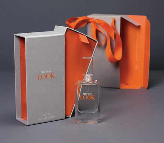
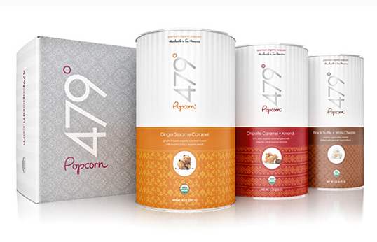
There is an excellent (albeit, long) article over at The Dieline that discusses the importance of branding in regards to package design. Check it out and leave us some thoughts. You might also check out Lovely Package for some inspiration. Below are some examples of some examples of my favorite package designs:


Subscribe to:
Posts (Atom)
