So I was browsing through the student flickrs and I came upon the personal account of Valencia Student Reina Castellanos. She was showcasing some recent self promotional pieces she created using a process called Gocco. Intrigued, I did a little search to find out more and happened along this little instructional video:
Gocco is a lot like screen printing. I'd love to get my hands on a kit, especially in time for my Portfolio class in the spring when I have to start making self promotional pieces. Additionally, it would be a great way to create some custom stationery, which the company wants to start selling sometime this year.
Did I mention that I have a birthday coming up? {hint hint nudge nudge say no more}

Tuesday, June 24, 2008
Friday, June 20, 2008
I {heart} Typography.... and didn't even realize it

I just wanted to share this totally rad photo I found of myself from elementary school. Just check out that awesome typography shirt. It just goes to show you that I should have known I was going to be a graphic designer from an early age. You just can't learn cool like this. You're born with it.
Thursday, June 19, 2008
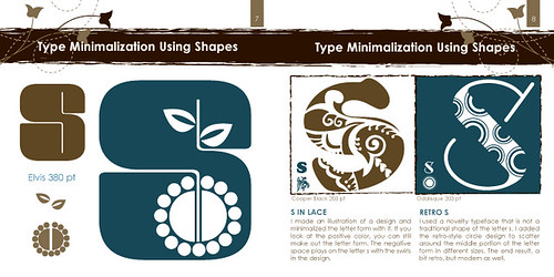
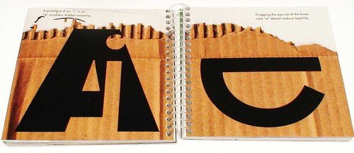
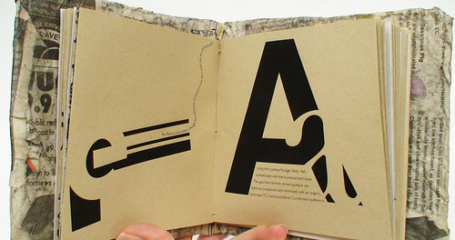
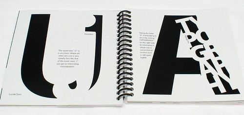
I {heart} Typographic Minimalization
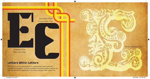
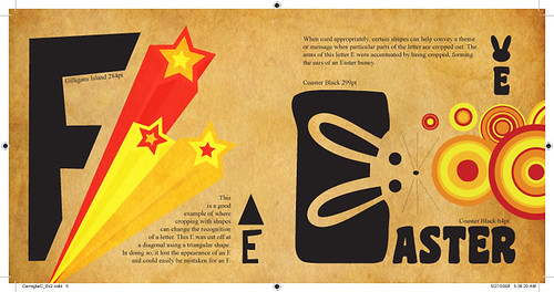
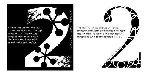
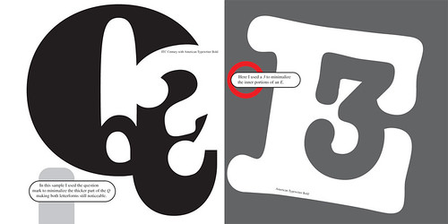
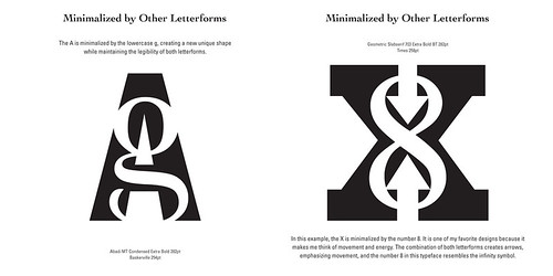
A few weeks ago, my typography class did an assignment on minimalization. The goal was to explore and experiment with various ways of minimalizing letterforms. And by minimalize I mean taking away from the letter without destroying it's readability. Students had to focus on one letter and one letter only for their examples - I chose the letter "E". Our examples had to include 3 different techniques for minimalizing the letter
1. Minimalization by other letterforms.
Subtracting from our letter with other letters.
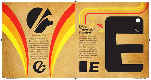
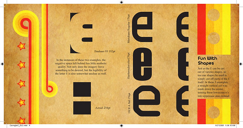
2. Minimalization by shapes.
Using shapes to subtract from or crop parts of our letter.
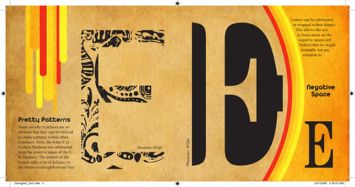
3. Minimalization by cropping within shapes.
Focusing on the negative space left behind.
Here are my examples (click on image to view larger on Flickr):
And here are some examples done by previous students:
Nick Melton
Joseph Bash
Holly Smith

Reina Castellanos
Katie Simari
Ed Cross
Efrain Lopez
Aaron Fischer
1. Minimalization by other letterforms.
Subtracting from our letter with other letters.
2. Minimalization by shapes.
Using shapes to subtract from or crop parts of our letter.
3. Minimalization by cropping within shapes.
Focusing on the negative space left behind.
Here are my examples (click on image to view larger on Flickr):
And here are some examples done by previous students:
Nick Melton
Joseph Bash
Holly Smith
Reina Castellanos
Katie Simari
Ed Cross
Efrain Lopez
Aaron Fischer
Saturday, June 14, 2008
I {heart} Updates
Not a whole lot to report, folks... just some minor updates here and there. It's been difficult finding time to blog, especially about projects, so I offer my humble apologize. Between working full time and school and living and breathing and eating, sometimes the last thing I want to do is sit a computer longer than I already have. Seriously... I spend at least 12-16 hours in front of my computer each day. But, truthfully, I don't mind that much. I love my computer and I think it loves me too. I will try to update here as often as I can. On the flip side though, you can keep yourself busy with checking out Portfolio and Flickr (see button images at right).
The Portfolio button will take you to my DeviantArt profile, where you can view final drafts of school projects, work for clients, and my own personal artwork. I'll gradually be adding deviations over the next couple months. I even have school projects from the Spring semester that I haven't uploaded yet cause I'm lazy... and busy... busy and lazy. There are some new client related projects that are worthy of showcasing as well. But.. I'll get those up when I get them up.
Flickr is where I will be posting images of works in progress, mostly on school stuff (such as the previous blog). Updates to Flickr will happen more often because it is quicker and easier to upload than it is to DeviantArt. Well, I guess it's about the same, but DeviantArt just feels longer, how bout that? Furthermore, my Flickr and Blog are directly linked, so I can quickly write up a blog about certain images and it will just post it for me. Ah, I love it when things are easy...
Oh and recently I've been getting back into photography, thanks to my good pal Rita Barnes. Yay Rita! I have literally hundreds of photos that I've taken in the last couple of weeks that I'd like to show you. I'll post a variety of them on Flickr for you to browse though, and hopefully post a blog about the adventures Rita and I had on each shoot.
Again, I will update as often as possible, but I expect that things will only get busier as I prepare to move to a new apartment in Altamonte Springs and Treefrog Cinegraphix starts construction on a MAJOR website project.
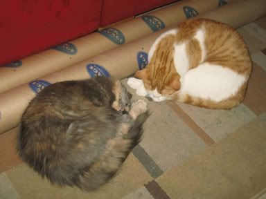
At least the cats get to sleep...
The Portfolio button will take you to my DeviantArt profile, where you can view final drafts of school projects, work for clients, and my own personal artwork. I'll gradually be adding deviations over the next couple months. I even have school projects from the Spring semester that I haven't uploaded yet cause I'm lazy... and busy... busy and lazy. There are some new client related projects that are worthy of showcasing as well. But.. I'll get those up when I get them up.
Flickr is where I will be posting images of works in progress, mostly on school stuff (such as the previous blog). Updates to Flickr will happen more often because it is quicker and easier to upload than it is to DeviantArt. Well, I guess it's about the same, but DeviantArt just feels longer, how bout that? Furthermore, my Flickr and Blog are directly linked, so I can quickly write up a blog about certain images and it will just post it for me. Ah, I love it when things are easy...
Oh and recently I've been getting back into photography, thanks to my good pal Rita Barnes. Yay Rita! I have literally hundreds of photos that I've taken in the last couple of weeks that I'd like to show you. I'll post a variety of them on Flickr for you to browse though, and hopefully post a blog about the adventures Rita and I had on each shoot.
Again, I will update as often as possible, but I expect that things will only get busier as I prepare to move to a new apartment in Altamonte Springs and Treefrog Cinegraphix starts construction on a MAJOR website project.
At least the cats get to sleep...

I {heart) Dirty Baby Photos
About 2 weeks ago we started our new Anti-Smoking campaigns in Advanced Graphic Design. The challenge of the project is to NOT use any cigarette or smoking related imagery. We have to convey the message in other means. It's easy to throw a few pictures of nasty cigarettes on a background and call it a day... but then that's what separates the little guns from the big guns.
Not that I'm a big gun or anything. Hardly. In fact, this campaign has been really difficult for me. Luckily I have an excellent pool of inspirational people and images to wade through.
The image here is the first of a series of 3 cohesive ads aimed at pregnant mothers to not smoke during their pregnancy. The idea is that smoking while pregnant is like throwing your baby away because it causes complications like miscarriages, still birth, and SIDS. I chose this one image out of 150 pictures that I took, because it conveyed that message best - and the class agreed.
I will post the best of the photos as soon as I can. Again... that's 150 pictures, folks. That means 150 images that I need to browse through, select, and edit. But they do look pretty cool, if I do say so myself.
I'll be doing another photo shoot, with help from Rita, sometime this weekend. We'll be shooting about 3 or 4 different concepts in the same day. I'll be presenting those concepts to the class Monday.
Keep your fingers crossed that I don't get rained on.
Subscribe to:
Posts (Atom)