As designers, we all started somewhere. For most of us, that meant getting an education. This semester, I've had the opportunity to teach, not one, but TWO sections of our 1142 Graphic Design Essentials course. This is the foundation course for the Graphics Technology Program. While some students are taking this course with the intentions of completing the program, others are taking it for fun, as an elective, or just to brush up on their skills. Regardless, it is always humbling to one day look back on your early works and to see just how far you've come.
One thing I always stress to my students is the importance of trial and error... of experimenting... of learning what works and what does not. Ultimately, they have to find their own methods and their own process. When we first start learning software, I provide them with brief, in-class exercises that are designed to get them to do just that.
Enter, the monogram exercise...
This exercise was given to the 1142 students when they were fresh to Illustrator. I asked them to "design" the first or first and last letter of their names. They were not given any detailed, step by step instructions... this was purely exploration time. The end results varied, but the ultimate intention was that they begin to get familiar with the software and various tools by their own means.
Feel free to comment, critique, or make suggestions for future exercises :)
 |
| Anna Ware |
 |
| Johnny Barragan |
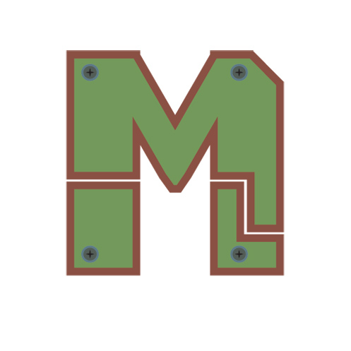 |
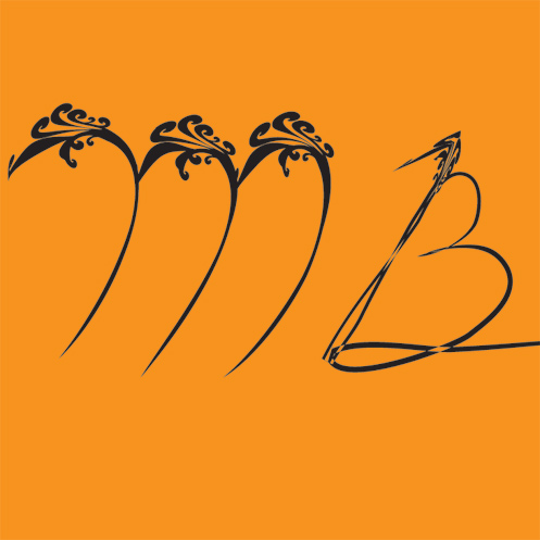
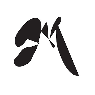
| Mike Sirizzotti |
 |
| Cory Rodis |
 |
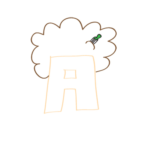
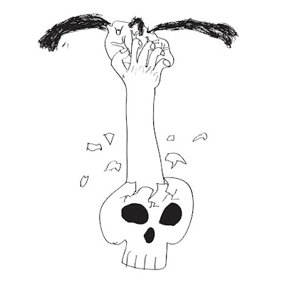
| Damien McLoughlin |
 |
| Kristie D'Agostino |
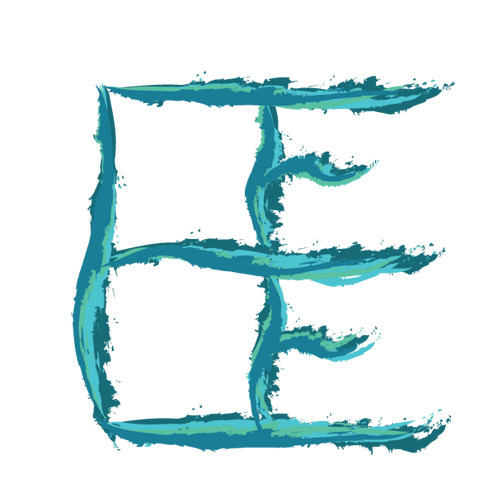 |
| Elaine Eichner |
 |
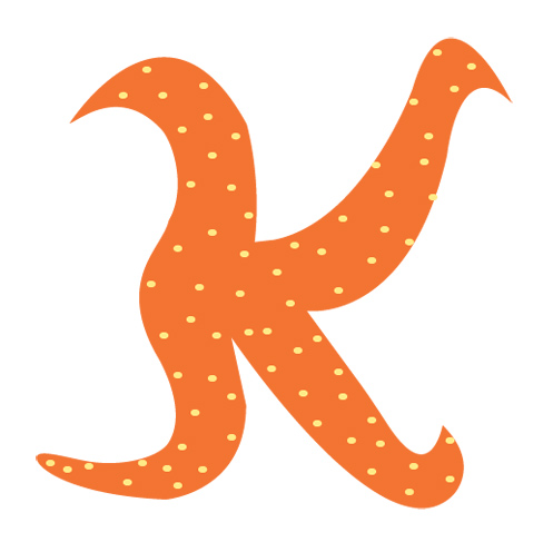
| Kathleen Carroll |
 |
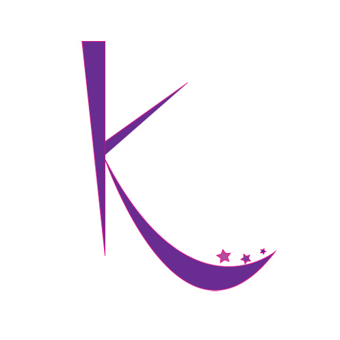
| Melissa Miller |
 |
| Melissa Castro |
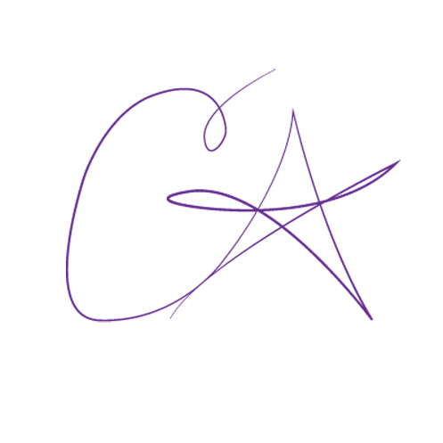 |
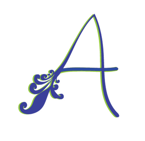
| Catherine Alexander |
 |
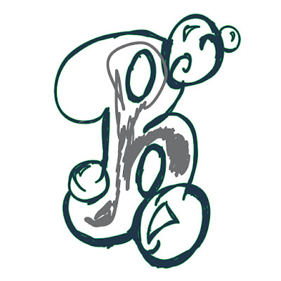
| John Blair |
 |
| Michael Barton |
 |
| Brent Hazelton-Glenn |
 |
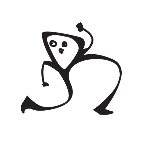
| Rosie Suarez |
 |
| Alice Moulton |
 |
| Amanda Kost |
 |
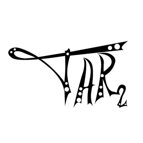
| Tyler Rolling |
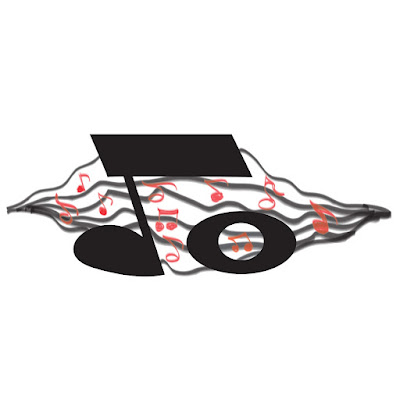 |
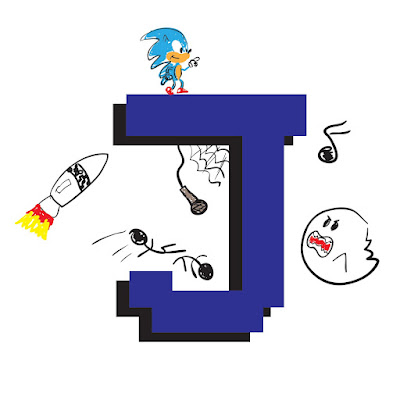
| Johnny Ocasio |
 |
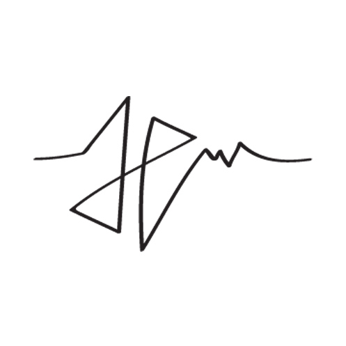
| John Mulgrav |
 |
| Terry Richards |


6 comments:
I like the monograms that look hand-drawn with additional images like Johnny Barragan's and Tyler Rolling's. You can tell they put a lot of effort into drawing the characters and making them look realistic. If they could tie in the letter with the images, I think it would make more sense. I like what Kathleen Carroll was attempting with the geometric shapes. If she made the lines of the "K" stand out more it would be easier to read. It might help to use different colors than the background colors. Cory Rodis' is fun and makes sense (R for Run) but would love to see some color and/or more detail added to liven it up. Melissa Castro's is cute but she could make the lines less straight and more natural, like you would see on a real butterfly. You can tell she was trying to fit the butterfly into an "M" shaped box. Mike Sirizzoti's "M" is technically well done and I could see that being someone's logo.
anna - simple and to the point...i like the cartoonish style it has...same with the next one but johnny brought together two styles - hand drawn cartoons and computer replicated letters...i like the pixel look of the letter...the next one uses shapes to reveal a story about its creator...but do the screws mean that he has some lose ones? i like the running man style of corys...it's real curvy and gangly...like he's always on the run? the next one just looks like it is a rough draft...is it finished? maybe he should redo it the pen tool...the purple one is cool with the right colors...simple shapes but they fit together nicely...elaines is unique and artistic with the brush strokes but i find it hard to make out the letter or is it letters? nice geometry in kathleens but once again i had to look at the name to figure out the letter...maybe if the k was all one color...melissa's m is one of my favorites... sleek and stylish with the right blue gradient...there are a couple that just look like the creator scribbled their signature/initials...i don't understand the effect or maybe they were just in a hurry...um that was way more than 7 sentences...oops!
Kathleen
I loved looking at these! Cory's running "R" was great! Melissa Miller's "M" was really run and creative. Catherine Alexander's was very impressive ... someone seems pretty comfortable with Illustrator ;-)Rosie's was one of my favorites! I love how she incorporated the rose into her "R".
Kathleen
On the flip side ... tyler's was a little dark for my taste. I love what J Ocassio was trying to do, but I wish the musical notes were more integrated into the letters. John Melgraves reminded me of the art of chinese watercolor calligraphy. I thought Alice's was simple and enjoyable to look at. All in all, it's great to see everyone's creativity!
I think everyone did a good job on the monograms exercise. My favorite was Rosie's R, it was very creative to make it look like a rose. This was a great exercise, it let us be creative and experiment with all the different tools in illustrator. Another, favorite of mine was Elaine's I like the colors she chose and the way it looks like it was don by a paint brush. Thanks for the compliment Kathleen i will definitely re-work the design and see what i can improve. Great job everyone I would love to see the improvements, after learning more about illustrator.
The Monogram Exercise was a great way to let students show their skills in Illustrator, while giving us a little insight into their personalities. Some students seemed more advanced in illustrator and it showed in their monograms, like my favorites by Melissa Castro, Mike Sirizotti and Cory Rodis. Some monograms made statements way beyond an initial, like those by Johnny Barragan, Tyler, & Johnny Ocasio. While others used the shape and colors of their initials to define their sense of style, like Kristie, Amanda, Cory & Terry. Kathleen's K was very neat and organized, and Elaines colorful free-hand E's conveyed the same feeling of movement and energy that she projects in person.
Post a Comment