
Sunday, October 19, 2008
Music Choices for Website Project
My next project in Web Design is to design a website for a music artist of my choice. I'm struggling to pick between 3 artists: Kate Havnevik, Zero 7, and Cobra Starship. I've decided to go ahead and do roughs for each, but here are a few tracks by each artist so you can get a better feel for who they are and whether or not the roughs I make would work for them.


Wednesday, October 8, 2008
Our new frog!
Over the last few months we've slowly been rebranding ourselves at Treefrog Cinegraphix: new look, new logo, new website. The new website will be up in a couple of weeks and the logo has only been simplified, but recently I finally got around to redesigning our frog icon. We wanted the look to be cuter and even a little more cartoony than the last. So here he is... new and improved.


Wednesday, September 24, 2008
Wine Poster
Just finished up my first project in Advanced Graphics II with Krity Peninno. We had to design a wine poster for this competition hosted by a Spanish wine company, Bodegas Terras Gauda. Aside from the basic competition specs, Kristy also gave us some constraints to which we had to adhere:
1. The entire piece had to be done by hand - no using the computer to do any work except adding the logo after scanning/photographing the finished piece.
2. It had do be 3-dimensional in some way.
Additionally, we also could only use our own work, which meant we couldn't use someone else's stock photography or images from magazines, etc.
The piece I ended up doing was an Art Nouveau piece done entirely with cut paper, ink, and watercolor paint. The golden frame is actually raised up from the background by about a quarter inch - this was done to help meet the 3-D requirement and give it some depth. It's still a bit rough, and I plan to go into Photoshop and fix up some of the line and color work (cause yeah, I totally didn't use those watercolors right). Overall thought I am pleased with the final outcome giving the difficulty I had putting the thing together.

Tuesday, September 2, 2008
New Illustration Portfolio
Hi all :) So I just went ahead and uploaded a whole bunch of work to my portfolio at Coroflot. It features my illustration and illustration only. So, please check it out when you have some time... maybe leave a comment cause comments are nice and they make me warm and fuzzy inside :)
Check it out here!
Check it out here!
Sunday, August 24, 2008
Nothing like some nitty gritty baby photos to start the day off right
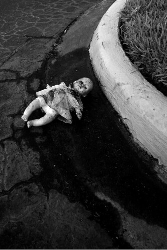
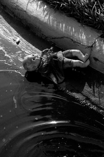
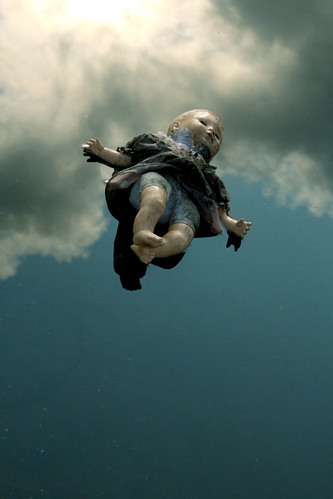
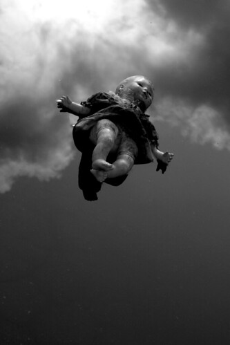
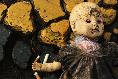
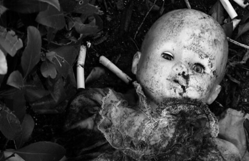
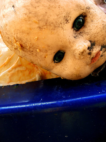
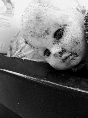
Over the summer I did a series of photo shoots for an anti-smoking campaign in Advanced Graphics I. This set of images is from the first shoot. The idea around the imagery was to simulate the environment a baby is living in while you're smoking during pregnancy. The premise was "would you do this to your baby?" The photos were to be graphic, dirty, and disgusting. But first I needed a baby.
So I went to Thriftko and spent all of $2 on a baby doll in a little pink dress. Perfect. I got up on a Sunday morning and headed over to the apartment complex of fellow photography aficionado and VCC student, Rita Barnes. Together we went around her development looking for the most vile, disgusting habitats to put our little "Peggy Sue" in... puddles, sewer pipes, trash cans, dumpsters... if it was nasty then we were happy. Peggy Sue got progressively dirtier and dirtier aa the morning wore on, and eventually we bagged her up and called it a day.
Below are some of the primo picks of the 150 we took that day. They've been given only slight color and contrast adjustments. I've also done alternates in black and white because it gives the imagery an entirely different (and darker) tone.











Saturday, July 26, 2008
If Fonts Were People
I discovered this video the other day, and it has to be the funniest vid that I have seen in a long time. This is probably because I am a giant graphic design/typography nerd. :3 Anyway, you don't have to know all of the fonts in this vid to appreciate the humor in this. Wingdings is by far my favorite character. Please enjoy!
Wednesday, July 23, 2008
Updates coming soon
I've been skimpy with my posts lately, but I promise there are blogs coming ahead. Just recently my external hard drive up and died, so I'm out all of my school, work, morgue, and portfolio files. It sucks - there's really no better way to put it. Finally, the semester is coming to a close, which means it's time for finals and projects. I have an ad campaign and brochure design for one class, and a typographic self portrait for another. My only written final is today (eek!). So once the semester is over I plan to have a few blogs to show you some of those projects plus a few other goodies. In the meantime though, you can watch this video that we made about our company.
Treefrog Cinegraphix from Christian Knightly on Vimeo.
Treefrog Cinegraphix from Christian Knightly on Vimeo.
Tuesday, June 24, 2008
I {heart} Gocco
So I was browsing through the student flickrs and I came upon the personal account of Valencia Student Reina Castellanos. She was showcasing some recent self promotional pieces she created using a process called Gocco. Intrigued, I did a little search to find out more and happened along this little instructional video:
Gocco is a lot like screen printing. I'd love to get my hands on a kit, especially in time for my Portfolio class in the spring when I have to start making self promotional pieces. Additionally, it would be a great way to create some custom stationery, which the company wants to start selling sometime this year.
Did I mention that I have a birthday coming up? {hint hint nudge nudge say no more}
Friday, June 20, 2008
I {heart} Typography.... and didn't even realize it
Thursday, June 19, 2008
I {heart} Typographic Minimalization
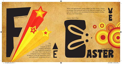
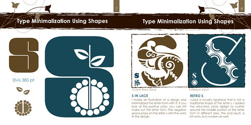
A few weeks ago, my typography class did an assignment on minimalization. The goal was to explore and experiment with various ways of minimalizing letterforms. And by minimalize I mean taking away from the letter without destroying it's readability. Students had to focus on one letter and one letter only for their examples - I chose the letter "E". Our examples had to include 3 different techniques for minimalizing the letter
1. Minimalization by other letterforms.
Subtracting from our letter with other letters.
2. Minimalization by shapes.
Using shapes to subtract from or crop parts of our letter.
3. Minimalization by cropping within shapes.
Focusing on the negative space left behind.
Here are my examples (click on image to view larger on Flickr):
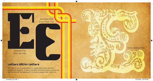
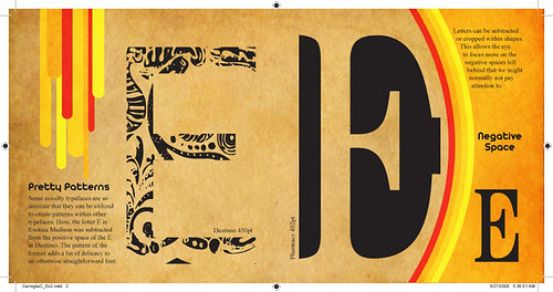
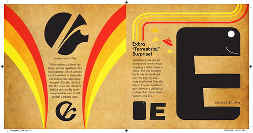
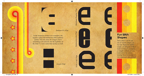
And here are some examples done by previous students:
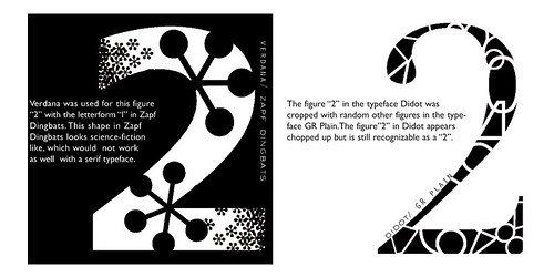
Nick Melton
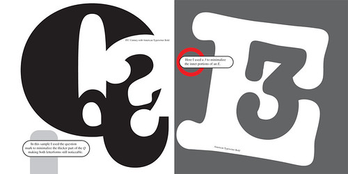
Joseph Bash
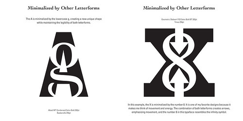
Holly Smith

Reina Castellanos
Katie Simari
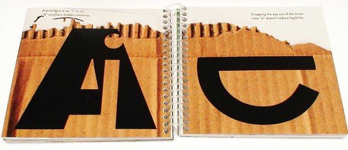
Ed Cross
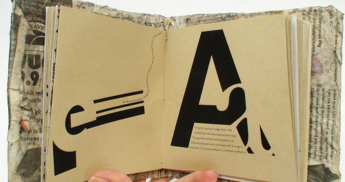
Efrain Lopez
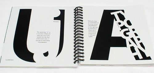
Aaron Fischer
1. Minimalization by other letterforms.
Subtracting from our letter with other letters.
2. Minimalization by shapes.
Using shapes to subtract from or crop parts of our letter.
3. Minimalization by cropping within shapes.
Focusing on the negative space left behind.
Here are my examples (click on image to view larger on Flickr):


And here are some examples done by previous students:

Nick Melton

Joseph Bash

Holly Smith

Reina Castellanos

Katie Simari

Ed Cross

Efrain Lopez

Aaron Fischer
Saturday, June 14, 2008
I {heart} Updates
Not a whole lot to report, folks... just some minor updates here and there. It's been difficult finding time to blog, especially about projects, so I offer my humble apologize. Between working full time and school and living and breathing and eating, sometimes the last thing I want to do is sit a computer longer than I already have. Seriously... I spend at least 12-16 hours in front of my computer each day. But, truthfully, I don't mind that much. I love my computer and I think it loves me too. I will try to update here as often as I can. On the flip side though, you can keep yourself busy with checking out Portfolio and Flickr (see button images at right).
The Portfolio button will take you to my DeviantArt profile, where you can view final drafts of school projects, work for clients, and my own personal artwork. I'll gradually be adding deviations over the next couple months. I even have school projects from the Spring semester that I haven't uploaded yet cause I'm lazy... and busy... busy and lazy. There are some new client related projects that are worthy of showcasing as well. But.. I'll get those up when I get them up.
Flickr is where I will be posting images of works in progress, mostly on school stuff (such as the previous blog). Updates to Flickr will happen more often because it is quicker and easier to upload than it is to DeviantArt. Well, I guess it's about the same, but DeviantArt just feels longer, how bout that? Furthermore, my Flickr and Blog are directly linked, so I can quickly write up a blog about certain images and it will just post it for me. Ah, I love it when things are easy...
Oh and recently I've been getting back into photography, thanks to my good pal Rita Barnes. Yay Rita! I have literally hundreds of photos that I've taken in the last couple of weeks that I'd like to show you. I'll post a variety of them on Flickr for you to browse though, and hopefully post a blog about the adventures Rita and I had on each shoot.
Again, I will update as often as possible, but I expect that things will only get busier as I prepare to move to a new apartment in Altamonte Springs and Treefrog Cinegraphix starts construction on a MAJOR website project.
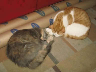
At least the cats get to sleep...

I {heart) Dirty Baby Photos
About 2 weeks ago we started our new Anti-Smoking campaigns in Advanced Graphic Design. The challenge of the project is to NOT use any cigarette or smoking related imagery. We have to convey the message in other means. It's easy to throw a few pictures of nasty cigarettes on a background and call it a day... but then that's what separates the little guns from the big guns.
Not that I'm a big gun or anything. Hardly. In fact, this campaign has been really difficult for me. Luckily I have an excellent pool of inspirational people and images to wade through.
The image here is the first of a series of 3 cohesive ads aimed at pregnant mothers to not smoke during their pregnancy. The idea is that smoking while pregnant is like throwing your baby away because it causes complications like miscarriages, still birth, and SIDS. I chose this one image out of 150 pictures that I took, because it conveyed that message best - and the class agreed.
I will post the best of the photos as soon as I can. Again... that's 150 pictures, folks. That means 150 images that I need to browse through, select, and edit. But they do look pretty cool, if I do say so myself.
I'll be doing another photo shoot, with help from Rita, sometime this weekend. We'll be shooting about 3 or 4 different concepts in the same day. I'll be presenting those concepts to the class Monday.
Keep your fingers crossed that I don't get rained on.
Saturday, May 24, 2008
Welcome!
Thanks for stopping by. As you can see, there's not a whole lot here at this moment, but I'll give you a rundown of what this blog will be about:
Basically...
I [heart] design.
Design and art is such an important, ongoing aspect of my life. I'm constantly aware of it all around me... whether it be fonts on a billboard that I recognize, cool textures on a wall, or the work of friends and family... design is an integral part of my world.
I do hope you will stop by regularly, as I plan to post about a variety of things going on in my life, most of which will be design related, but some of which may just be random thoughts and stories. You'll get to hear what's going on in the company and about some of the projects we're working on. When I find good resources, articles, and inspiration, this will be the place to learn about them. Additionally, I'll be posting some of my own personal projects so you can leave your thoughts and suggestions on them.
Come back soon... you know you want to :)
Subscribe to:
Comments (Atom)


