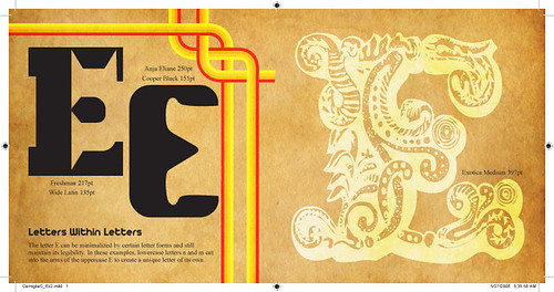
1. Minimalization by other letterforms.
Subtracting from our letter with other letters.
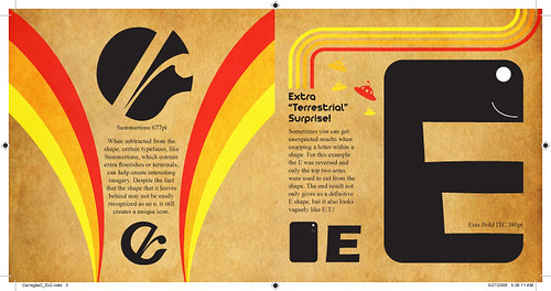
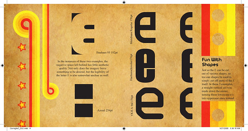
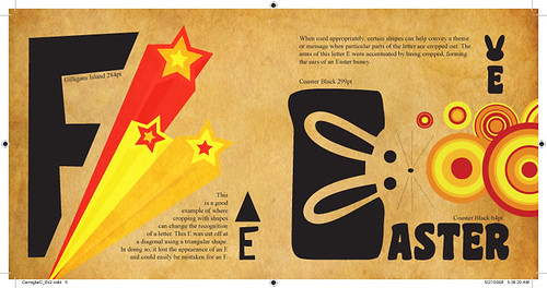
2. Minimalization by shapes.
Using shapes to subtract from or crop parts of our letter.
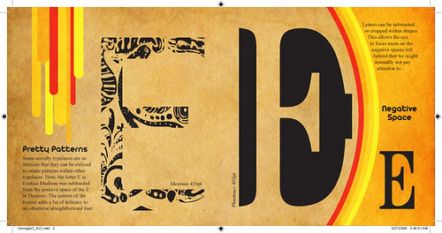
3. Minimalization by cropping within shapes.
Focusing on the negative space left behind.
Here are my examples (click on image to view larger on Flickr):
And here are some examples done by previous students:
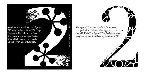
Nick Melton
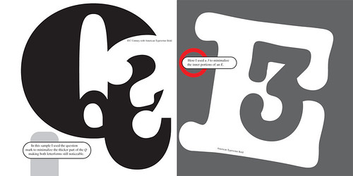
Joseph Bash
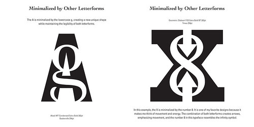
Holly Smith

Reina Castellanos
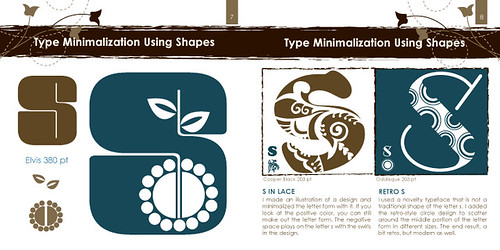
Katie Simari
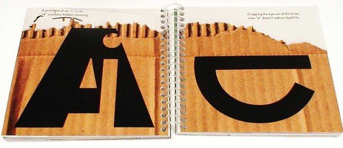
Ed Cross
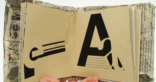
Efrain Lopez
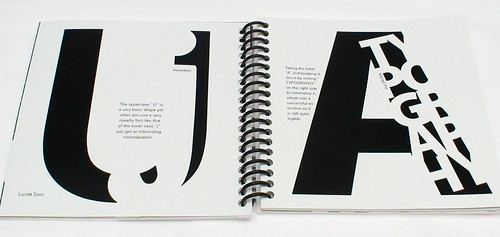
Aaron Fischer

4 comments:
great work---especially because you are MY daughter! Keep up the great creative work!
I agree it is very nice work. :)
Nice work…. minimalizing the letterforms without even destroying its readability is something that almost all the web designers will be interested in. Thanks for sharing.
nice!
Post a Comment